COURCHEVEL’S NEW IDENTITY

NEW IDENTITY FOR COURCHEVEL
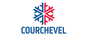
Starting this winter, a new logo will unfold on the station of Courchevel. The goal? Improve our visibility by sharing a new logo that is simpler and easier to use for everyone involved in the station.
In recent years, Courchevel no longer had a logo but twenty declinations that coexisted on the station. This diversity was detrimental to the brand and the destination as it weakened its visual identity. The previous logo dating back a dozen years , it was necessary to evolve, make it more readable and simplify to improve the visibility of the Courchevel brand and promote consistent use by all stakeholders.
Thus, the logo has benefited from a real facelift. While keeping the snowflake, true emblem of Courchevel for 45 years, the logo has freed many technical constraints making its complex use: removal of shadows and shades of colors, flattening of the flake, and especially new typography improving the readability of the word Courchevel on any scale.
This new logo is also the symbol of a new territory, that of the new municipality of Courchevel created on January 1, 2017.
A large "cleaning" operation will start this winter to remove the multitude of old logos and a complete graphic chart will soon be sent to socioprofessionals to present the new logo and accompany them in the use of it.
Thsi report comes from the Courchevel site http://www.mairie-courchevel.com/actualites/actualite/nouvelle-identite-visuelle.html
